What to do with categorical data?
- Categorical data can be challenging to analyze quantitatively
- In language research we often have data that are purely categorical
- In today’s presentation we will deal with a specific type of categorical data found in questionnaires
Questionnaire Data
- Questionnaires are frequently used in a variety of language research scenarios
- They often ask people to rate something (likert scales) or select the most appropriate response
- Example: select the language that is most appropriate to use in a given domain
- Example: rate level of agreement with several statements
Research Question
- How do the questionnaire respondents relate to each other based on their responses?
- In other words: what groups of respodents emerge based on their responses?
Cluster Analysis
- Cluster analysis is a family of statistical techniques that shows groups of respondents based on their responses
- Cluster analysis is a descriptive tool and doesn’t give p-values per se, though there are some helpful diagnostics
Common cluster analyses
- k-means clustering
- k-medoids clustering or partitioning around medoids (PAM)
- DBSCAN (density based clustering)
- hierarchical clusters
PAM
- This presentation will focus on the use of PAM
- Works in general by finding a pre-determined number of groups in the data and iteratively tries to find an ideal solution based on assigning a center point for each cluster and all other data points to the appropriate center point
- Is more robust to outliers than k-means since uses medians rather than means
Example Data
- For the sample cluster analysis we will be using data from a questionnaire used on Pohnpei
- There are 25 questions where the respondents were asked to select 1 language that is the most important for that specific domain
- The answers for all 25 questions were the same 8 language choices
- 301 respondents
domains <- read.csv("domains.csv")
Explore the data
| English |
English |
English |
English |
English |
English |
English |
English |
English |
English |
English |
English |
English |
English |
Other |
English |
English |
English |
English |
English |
English |
English |
English |
English |
Other |
| Pohnpeian |
Pohnpeian |
Pohnpeian |
Pohnpeian |
Pohnpeian |
Pingelapese |
Pohnpeian |
Pohnpeian |
Pohnpeian |
Pohnpeian |
Pohnpeian |
Pohnpeian |
Pohnpeian |
Pohnpeian |
Pohnpeian |
Pohnpeian |
Pohnpeian |
Pohnpeian |
Pohnpeian |
Pohnpeian |
Pohnpeian |
Pohnpeian |
Pohnpeian |
Pohnpeian |
Pohnpeian |
| Pohnpeian |
English |
English |
Pohnpeian |
English |
English |
English |
English |
English |
Pohnpeian |
Pohnpeian |
Pohnpeian |
Pohnpeian |
Pohnpeian |
Pohnpeian |
English |
Pohnpeian |
Pohnpeian |
English |
English |
Pohnpeian |
Pohnpeian |
Pohnpeian |
Pohnpeian |
English |
| Pohnpeian |
English |
English |
English |
English |
English |
English |
English |
English |
Pohnpeian |
English |
English |
Pohnpeian |
Pohnpeian |
Pohnpeian |
Pohnpeian |
Pohnpeian |
Pohnpeian |
English |
English |
English |
Pohnpeian |
Pohnpeian |
Pohnpeian |
Pohnpeian |
| English |
English |
English |
English |
English |
English |
English |
English |
English |
Pohnpeian |
English |
Pohnpeian |
Pohnpeian |
Pohnpeian |
Pohnpeian |
English |
Pohnpeian |
Pohnpeian |
Pohnpeian |
English |
English |
Pohnpeian |
Pohnpeian |
Pohnpeian |
English |
| Pohnpeian |
English |
English |
Pohnpeian |
English |
English |
English |
English |
English |
Pohnpeian |
English |
Pohnpeian |
Pohnpeian |
Pohnpeian |
Pohnpeian |
English |
Pohnpeian |
Pohnpeian |
Pohnpeian |
English |
English |
Pohnpeian |
Pohnpeian |
Pohnpeian |
English |
Libraries we’ll use
library(tidyverse)
library(hrbrthemes)
library(cluster)
library(NbClust)
library(factoextra)
Step 1: Create a dissimilarity matrix
- In order to cluster respondents, we need to calculate how dissimilar each respondent is from each other respondent
- To calculate a dissimilarity matrix, we use the Gower dissimilarity calculation that works for categorical data, instead of the Euclidean method for numerical data
- We use the
daisy() function from the cluster package
- Responses range from 0–1
- Values of 1 are completely dissimilar and values of 0 means identical responses
Calculate the dissimilarity matrix
domains.dist <- daisy(domains,metric="gower")
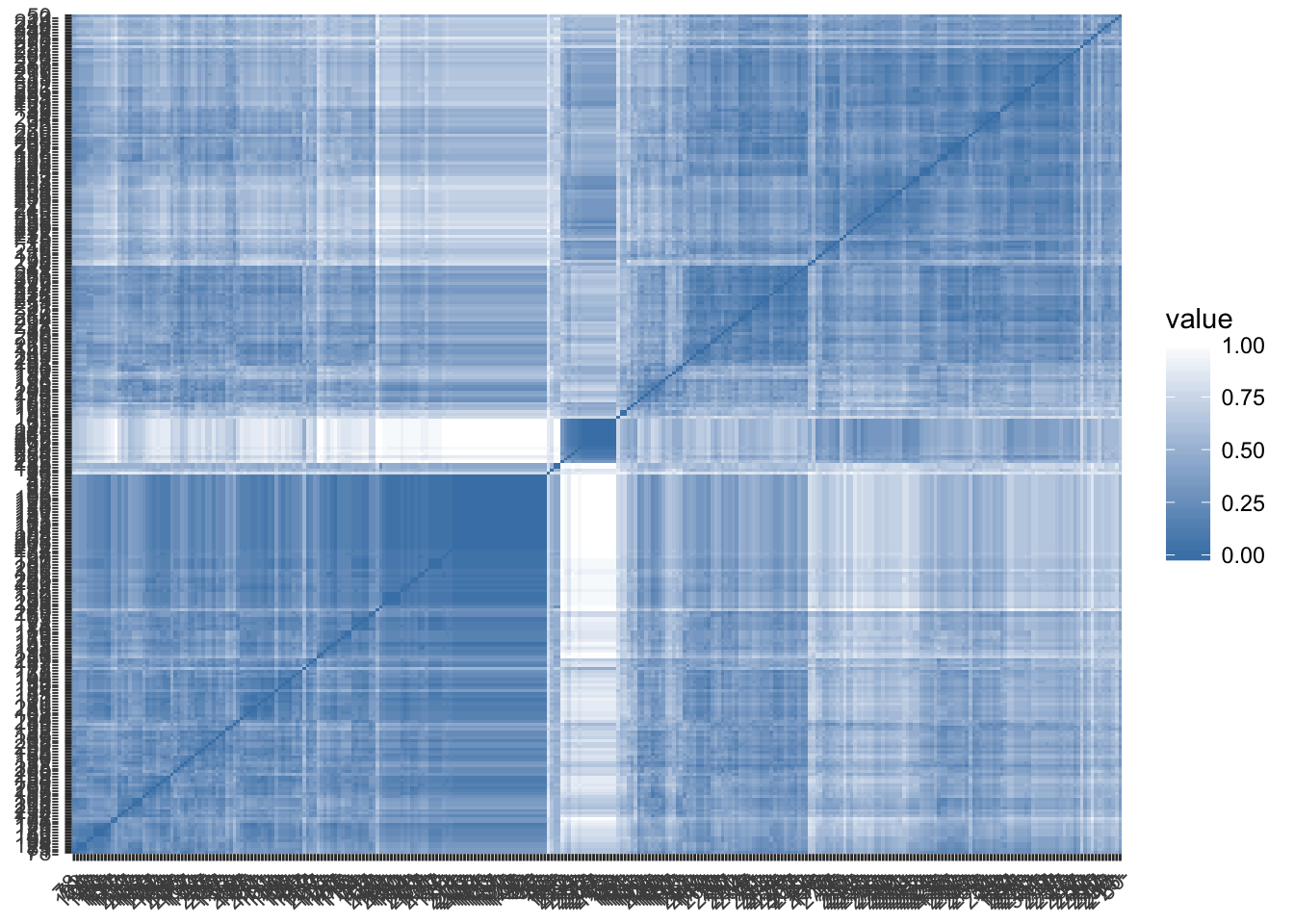
Visualize matrix
gradient.color <- list(low = "steelblue",  high = "white")
fviz_dist(domains.dist,
   gradient = gradient.color,order=T)
Step 2: Determine number of clusters
- Clustering algorithms such as PAM require the number of clusters to be pre-specified
- You can determine the number of clusters based on theory or research expectations
- Or more commonly through some sort of diagnostic that allows the number of clusters to emerge from the data
- For categorical data, one common way is the silhouette method (numerical data have many other possible diagonstics)
Silhouette Method
- The silhouette method calculates for a range of cluster sizes how similar values in a particular cluster are to each other versus how similar they are to values outside their cluster
- For this method, an ideal arrangement would have values being very similar to other members of its cluster and very dissimilar with those values outside its cluster
- The method gives score overall from -1 to 1 for each number of clusters, where 1 means very well clustered and -1 very poorly clustered
- The number of clusters with the best score is selected
Calculating silhouette method
number_clusters <- NbClust(diss=domains.dist,distance=NULL,
                          min.nc = 2, max.nc = 10,
                          method = "median",
                          index="silhouette")
##
##  Only frey, mcclain, cindex, sihouette and dunn can be computed. To compute the other indices, data matrix is needed
number_clusters$Best.nc # best solution
## Number_clusters     Value_Index
##          2.0000          0.3413
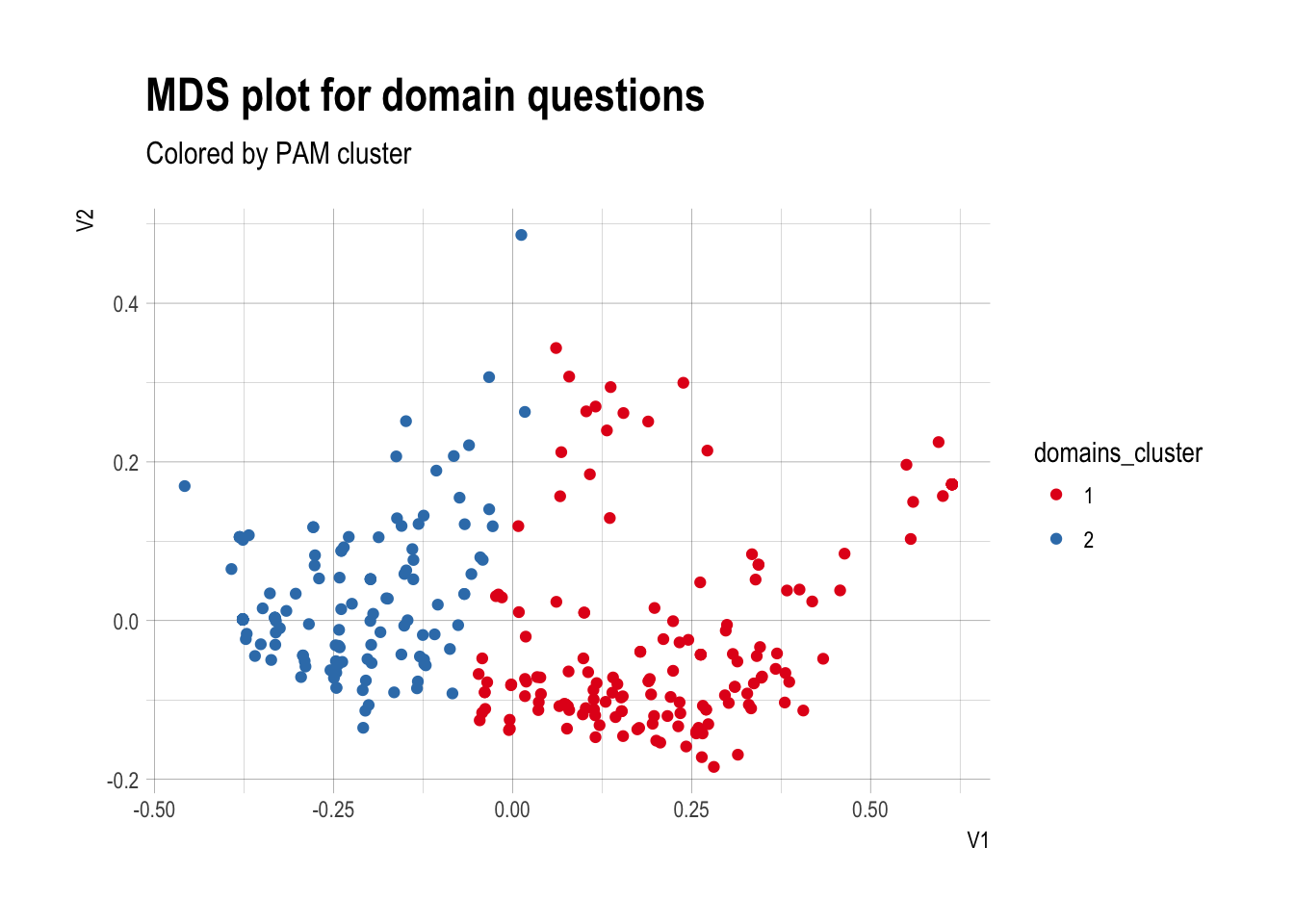
Step 3: Run PAM
- Based on the silhouette method, we will use 2 clusters
domains.pam <- pam(domains.dist,2)
Visualizing the PAM
- To visual the PAM, we can reduce the complexity of the dissimilarity matrix to 2 dimensions via multidimensional scaling
- Then can add color for each cluster
domains.mds <- as.data.frame(cmdscale(domains.dist,2))
domains.mds$domains_cluster <- as.factor(domains.pam$clustering)
ggplot(domains.mds,aes(x=V1,y=V2,color=domains_cluster)) +
  geom_point() + theme_ipsum() +
  labs(title="MDS plot for domain questions",
       subtitle="Colored by PAM cluster") +
  scale_color_brewer(palette="Set1")
Clusters plotted
Step 4: Interpret the clusters
- Now that the clusters are created, we have to evaluate whether or not they tell a meaningful story about the data, since it could just be a random grouping of the data
- Need to determine: (a) what pattern(s)/behavior(s) each cluster represents and (b) who is in each group
- Remember: Clusters are descriptive/exploratory, rather than a statistical test
- For (a) can subset data by cluster and compare how each group answered the different questionnaire questions
- For (b) can subset data by cluster, then compare each cluster by known demographic variables
Subsetting
domains$domains_cluster <- domains.mds$domains_cluster
language_domains_social_solidarity <- domains %>%
  dplyr::select(making_friends,happy_relationships,accepted_pni,
                talking_villages,talking_kolonia,talking_neighbors,
                us_relatives,domains_cluster)
names(language_domains_social_solidarity) <-c(
  "Making friends",
  "Feeling happy in your relationships",
  "Being accepted in Pohnpei",
  "Talking with people in the sections of Pohnpei",
  "Talking with people in Kolonia",
  "Talking with your neighbors",
  "Speaking with relatives who live in the US",
  "Domain PAM cluster")
language_domains_social_solidarity_gathered <- language_domains_social_solidarity %>%
  gather(key="domain",value="language",-"Domain PAM cluster")
Plot of some answers by cluster
ggplot(language_domains_social_solidarity_gathered,
       aes(x=domain,fill=language)) +
  geom_bar(stat="count",position="dodge",width=0.7)  +
  theme_ipsum(grid="Y") + scale_fill_brewer(palette="Set2") +
  labs(title="Language importance by PAM cluster",
       subtitle="Social solidarity domains") +
  xlab("Domain")+ theme(axis.text.x =
                          element_text(angle = 20,hjust=1,size=8),
                        legend.position="bottom",
                        legend.text=element_text(size=10))+
  ylab("Number of respondents") + facet_grid(~`Domain PAM cluster`)
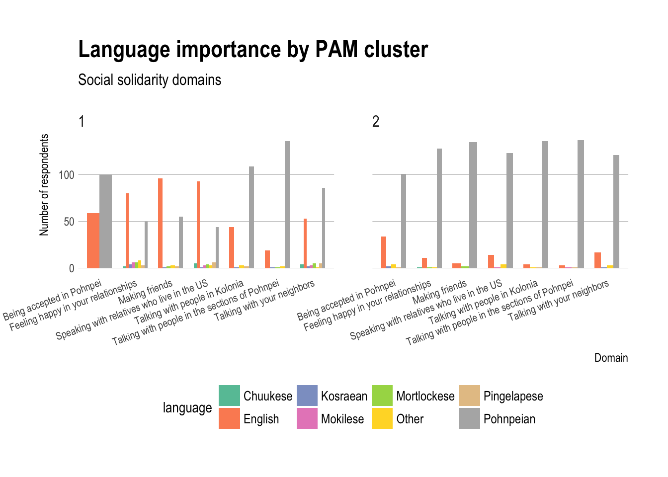
Interpretation: what
- For (a), based on the plots, you can describe different patterns and trends that occur, such as group 1 has more English selections as well as languages other than Pohnpeian, while group 2 tends toward only Pohnpeian selections
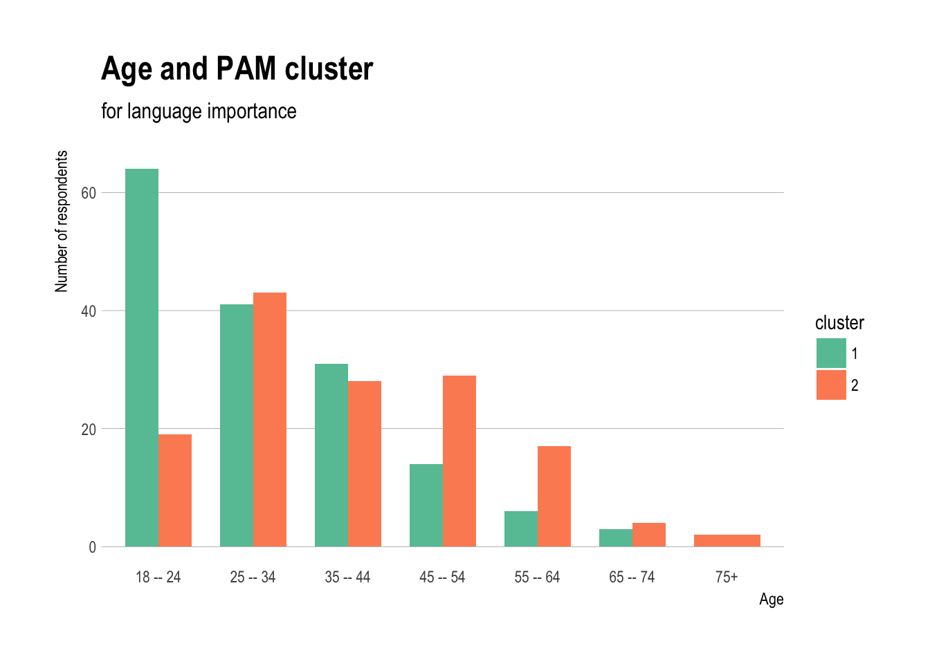
Determining who is in each cluster
- To determine who is in each cluster, we import the demographic data and add the cluster information to it
- Then plot the clusters by several demograhpic variables
demos <- read.csv("demos.csv")
demos$cluster <- as.factor(domains.mds$domains_cluster)
Age and PAM cluster
ggplot(demos,aes(x=age,fill=cluster)) +
  geom_bar(stat="count",position="dodge",width=0.7)  +
  theme_ipsum(grid="Y") + scale_fill_brewer(palette="Set2") +
  labs(title="Age and PAM cluster",
       subtitle="for language importance") +
  xlab("Age")+
  ylab("Number of respondents")
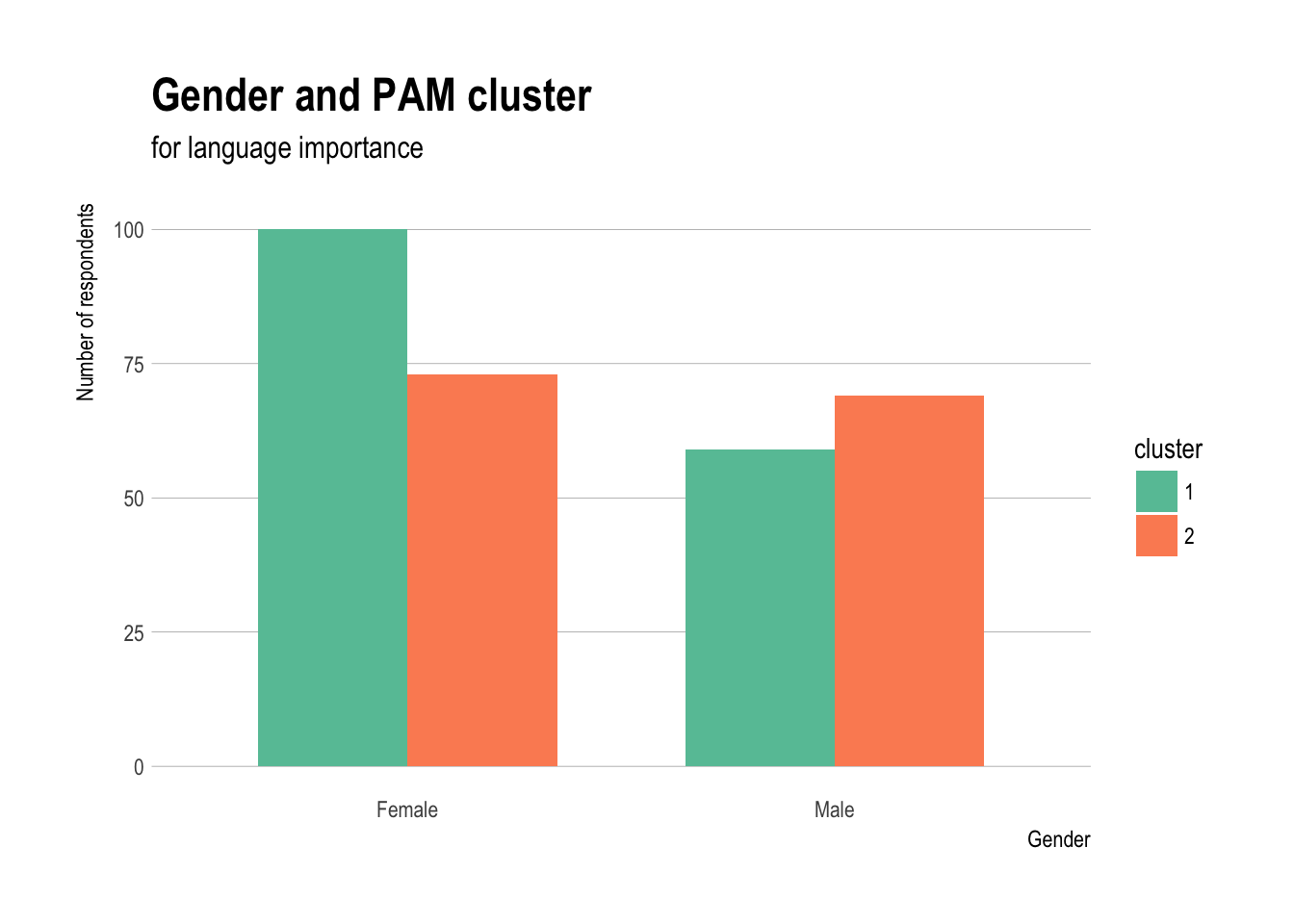
Gender and PAM cluster
ggplot(demos,aes(x=sex,fill=cluster)) +
  geom_bar(stat="count",position="dodge",width=0.7)  +
  theme_ipsum(grid="Y") + scale_fill_brewer(palette="Set2") +
  labs(title="Gender and PAM cluster",
       subtitle="for language importance") +
  xlab("Gender")+
  ylab("Number of respondents")
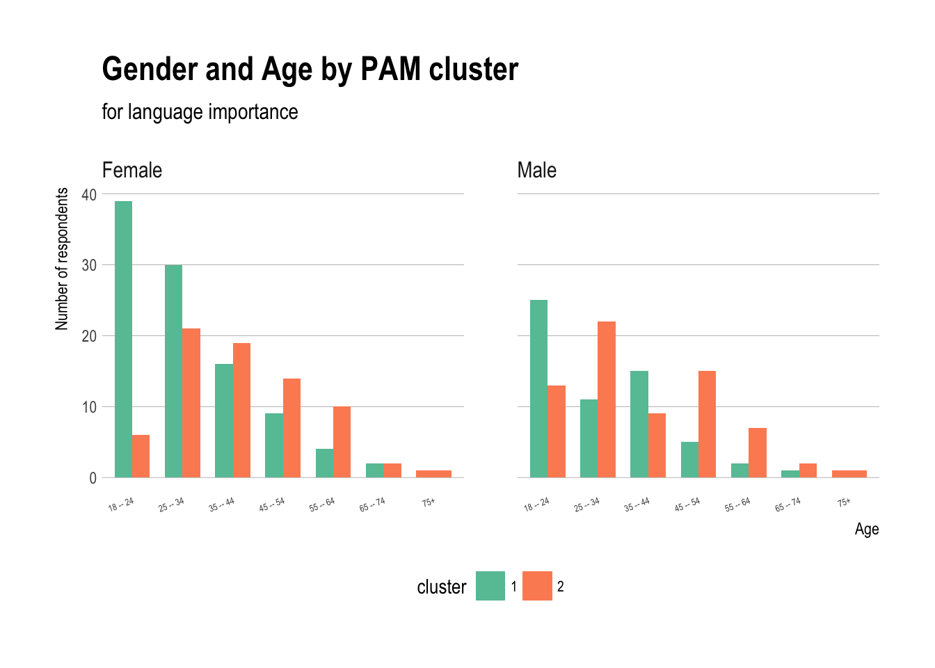
Gender and Age by PAM cluster
ggplot(demos,aes(x=age,fill=cluster)) +
  geom_bar(stat="count",position="dodge",width=0.7)  +
  theme_ipsum(grid="Y") + scale_fill_brewer(palette="Set2") +
  labs(title="Gender and Age by PAM cluster",
       subtitle="for language importance") + theme(axis.text.x =
                          element_text(angle = 20,hjust=1,size=5),
                        legend.position="bottom",
                        legend.text=element_text(size=8)) +
  xlab("Age")+
  ylab("Number of respondents") + facet_grid(~sex)
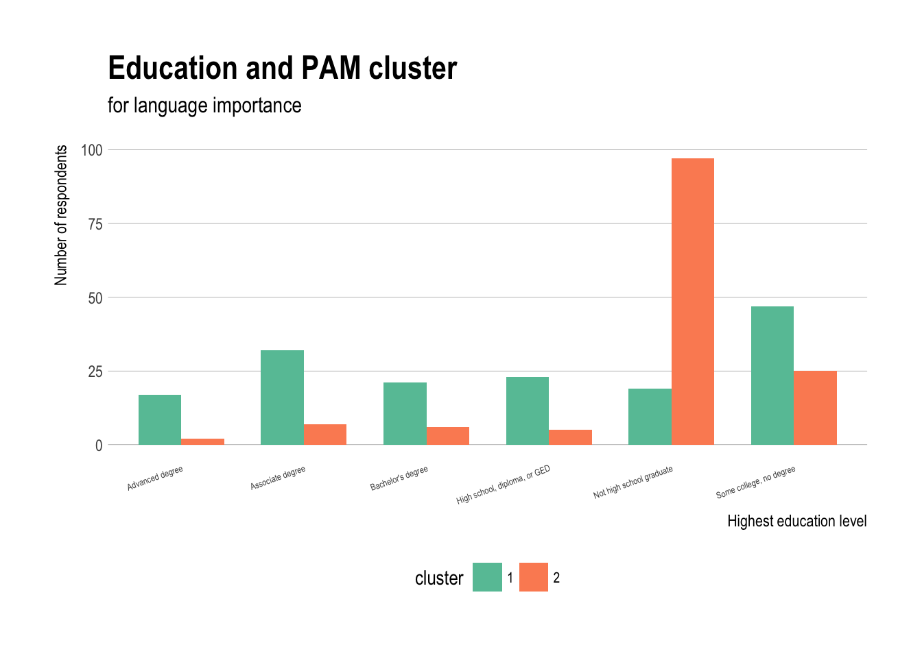
Eduation and PAM cluster
ggplot(demos,aes(x=education,fill=cluster)) +
  geom_bar(stat="count",position="dodge",width=0.7)  +
  theme_ipsum(grid="Y") + scale_fill_brewer(palette="Set2") +
  labs(title="Education and PAM cluster",
       subtitle="for language importance") + theme(axis.text.x =
                          element_text(angle = 20,hjust=1,size=5),
                        legend.position="bottom",
                        legend.text=element_text(size=8))+
  xlab("Highest education level")+
  ylab("Number of respondents")
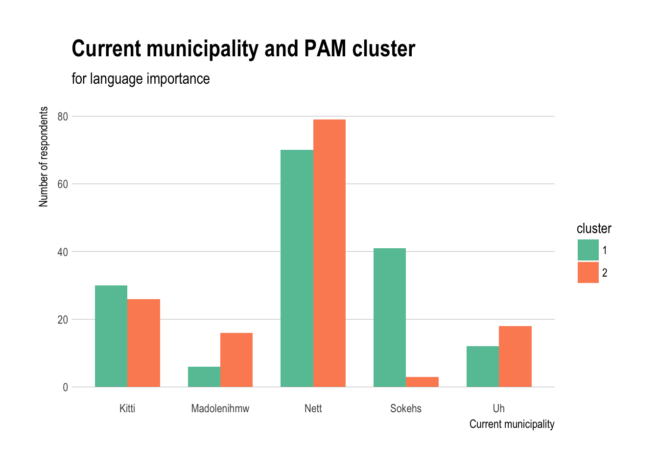
Current municipality and PAM cluster
ggplot(demos,aes(x=current_muni,fill=cluster)) +
  geom_bar(stat="count",position="dodge",width=0.7)  +
  theme_ipsum(grid="Y") + scale_fill_brewer(palette="Set2") +
  labs(title="Current municipality and PAM cluster",
       subtitle="for language importance") +
  xlab("Current municipality")+
  ylab("Number of respondents")
Interpretation: who
- People aged 18–24 have much greater numbers in cluster 1, ages 25–44 are fairly equally distributed, and ages 45+ have more respondents in cluster 2
- Gender is more evenly distributed with somewhat more women in cluster 1
- Both women and men aged 18–24 tend to be in cluster 1, but somewhat more women aged 25–34 in cluster 1, and slightly more men in that age group in cluster 2
- Those who completed high school tend be in cluster 1 and those who did not are more likely in cluster 2
- All municipalities except Sokehs have fairly similar distributions, which tends to be in cluster 1
Conclusion
- Cluster analysis can help find emergent patterns in the data
- These patterns can be similar to what is found with other statistical models such as regression
- But more importantly can help find patterns and global trends across your own coded groups (such as demographic variables) that may be missed by other methods
- Can also show more complex (aka non-linear) trends than regression modeling
- Cluster analysis can be a very helpful data exploration and analysis technique
- Though lacks probabilities of group membership and significance testing